Installation view, exhibition room, American Fine Arts, Co., New York, 1992
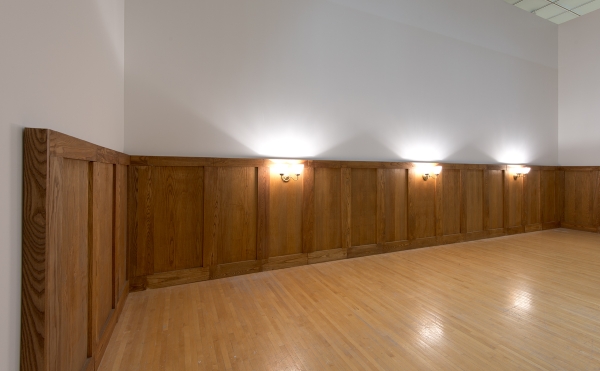
Installation view, exhibition room, American Fine Arts, Co., New York, 1992
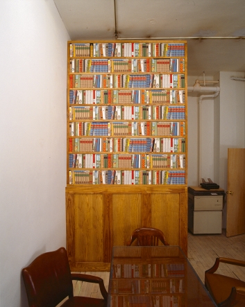
Installation view, office of the gallery owner, American Fine Arts, Co., New York, 1992
Installation view, Museum of Contemporary Art, Los Angeles, 2014
Installation view, Museum of Contemporary Art, Los Angeles, 2014
A Sense of Friendliness, Mellowness, and Permanence
22 November – 23 December 1992
American Fine Arts, Co., New York
Exhibition Room:
– “Untitled,” 1992, felt curtain, faux leather, brass; two components; 90 x 65 / 90 x 85 inches, The Museum of Contemporary Art, Los Angeles
– “Maître d’ Stand,” 1992, oak, American Fine Arts menus (number variable), guest list, yellow pages and two telephone books from New York, mobile telephone); 55.5 x 19.25 x 18.5 inches; The Museum of Contemporary Art, Los Angeles
– “Disguise,” 1992, wooden planks made of oak, wall lamps made of brass and glass; height: 55 inches, width: variable; partially owned by: Themistocles and Dare Michos, San Francisco; The Museum of Contemporary Art, Los Angeles; collection of Peter Weibel; Sammlung Wiese, München
Office of the Gallery Owner:
– “Ma Bibliothèque,” 1992, wall paper, oak, artists books, cognac carafe, gilded; 95 x 79 x 13 inches; Collection Barbara and Howard Morse, New York
Christian Philipp Müller’s first solo exhibition at American Fine Arts, Co., in New York in 1992 explored positionings — Müller’s own position as a European in the New York art world and that of the gallery American Fine Arts (as a representative of a precarious model balancing between commercial interest and institutional critique).
In the summer of that year, gallery director Colin de Land had presented the works of a selection of conceptual artists, namely, Tom Burr, Mark Dion, Andrea Fraser, and Christian Philipp Müller, together with reference positions by Dan Graham, Douglas Huebler, John Knight, Louise Lawler, Stephen Prina, and Christopher Williams. In this context, de Land had divided the exhibition space into two zones. The front third of the gallery was turned into an improvised café-bar; from there, a door designated “art gallery” led from the “social” to the “commercial” space. This attempt to circumvent the prescribed organization of a sales floor and produce a leisure space for social interaction failed in a number of respects. In the first place, neither the material nor the personnel resources were available for running a café; moreover, this mix of the commercial with the informal and personal was, more than ever, common in the gallery business.
Müller’s exhibition “A Sense of Friendliness, Mellowness, and Permanence” took place shortly thereafter in November and December. Taking as his point of departure de Land’s attempt to introduce social spaces into the gallery system, Müller pushed the implementation of this kind of social space to a more radical extreme. The entrance to the gallery was protected by a vestibule of brown felt as seen in cafés in Vienna. Upon entering, visitors encountered a “maître d’ stand,” the reservation podium that serves as the locus of social control in upscale New York restaurants. Here, a menu was provided, outlining the history of the gallery and listing the artists on view with their available works and prices. The neutral white of the gallery walls was overlaid with heavy ash-wood paneling, likewise inspired by a Viennese prototype by Adolf Loos. Sconces mounted in the paneling bathed the room in a warm half-light. There was no furniture whatsoever; if visitors wanted to sit they had to walk over to the art dealer’s desk, forcing them to engage in a sales conversation. The office area was cleaned up out for the exhibition; here, along with the paneling, a book-pattern wallpaper was installed from floor to ceiling, an American luxury item showing the spines of exclusively European publications. In front of this imaginary library, Müller placed a cabinet with his own production of European publications, the only books in the installation.
Exerpt from: Axel John Wieder, “So Long,” in Dealing With--Some Texts, Images, and Thoughts Related to American Fine Arts, Co., ed. Valérie Knoll, Hannes Loichinger, and Magnus Schäfer (Berlin: Sternberg Press, 2012), 31-32.
Müller's show, "A Sense of Friendliness, Mellowness, and Permanence" (1992), was based on de Land's idea of economically securing the gallery with a second foothold. A part of the gallery was to be used as a café-bar and thus included the gallery's function as a social meeting place in its economy – an idea that was logical but difficult to put into practice with everything involved in running a professional catering outlet. During the summer of 1992, de Land showcased a group exhibition with artists of the gallery in its back rooms, normally used as an office and informal meeting place, while the front part was furnished as an improvised café – connected by a door with the inscription "Art Gallery." A few months later, Müller's show adopted these spatial considerations and formalized them by means of a number of interventions. The entrance of the gallery was covered with a windscreen made of brown felt curtains like in Viennese cafés and the gallery walls were lined with half-high wooden panels, as seen in many cafés throughout the world.[1] A number of lamps on the panels imbued the space in a dimmed light signaling conviviality. Opposite the entrance was a standing desk like those typically found in American restaurants, a so-called maître d' stand, which is used to make reservations, allot seats, and display the menus. In Müller's show, the menus on the stand, however, introduced the history of the gallery and its artists along with the prices of their works. Apart from these elements, the front part of the gallery remained empty. In the back part – the office – which visitors had to enter if they had questions about the show, the wall paneling continued, supplemented by an installation of shelves, on the front of which there was photo wallpaper depicting book spines of European publications. In this allusion to a library, Müller presented a series of his own conceptual book projects – which had hitherto made up a significant part of his artistic practice-sorted in among the European classics. The exhibition took up the newly arranged spaces of AFA and reinforced their conceptual effect.
The café-bar, as initiated by de Land, appeared not only as the desire for a functionalist use, but was above all a reflection on the connection between commercial informal and social aspects of gallery work. Through the attempt to establish the café as an additional commercial branch of the AFA enterprise, these interrelations were visualized in the form of a staging that extended into the day-to-day operations. Moreover, Müller's show expanded the arrangement in the metaphors of a restaurant by the role of the gallery's artists, who were presented as appetizers of the business, so to speak. The office as the gallery's actual center of discourse, where sales take place-for the most part invisibly was put at the disposal of a no less cliché-laden, intensive debate, in which Müller ironically portrayed himself as a European import.[2]
Footnotes
- The specific form of the panels used by Müller is based on a design by Adolf Loos (1870-1933), Austro·Hungarian architect and early modernist.
- A further aspect of the work is its reference to the considerations made at the time on the service character of art – on the usability of artworks in the form of archives or discourse platforms, but also as cafés and libraries, which were canalized by exhibitions such as the survey show "Kontext Kunst" curated by Peter Weibel at the Neue Galerie Graz, "Backstage" at the Hamburger Kunstverein, "Sonsbeek" in Arnheim, and "Projet Unite" in a unite d'habitation by Le Corbusier in Firminy near St. Etienne (all 1993), and critically reflected upon that same year in the project "Services" in the Kunstraum of the University Lüneburg, organized by Andrea Fraser and Helmut Draxler. Müller describes his installation in the office of the gallery along these lines as a "tidy atmosphere for successful sales talks." See Christian Philipp Müller, in Kontext Kunst: The Art of the 90s, ed. Peter Weibel, (Cologne: DuMont, 1994), 454-55.


